
10 Ways In Which These Famous Brand Logos Have Changed Overtime!
- 6:42 pm June 13, 2021
- surabhi
These are some of the brands you absolutely love, and have perhaps grown up around. However, like all good things, these brands too have taken time to reach where they are today. When they first started out everything about them was so different. But today, they have realized what works for them and are doing so well at it. Their journey's are truly such an inspiration.
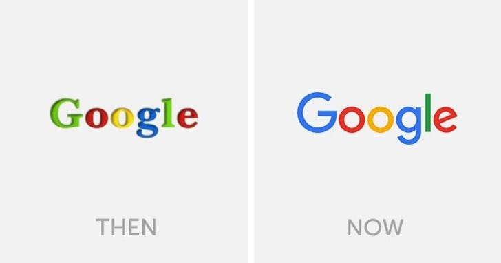
This amazing - practically - life changing technology company started in 1998. They caught up to the internet boom and how! They are practically spearheading the world of search engines today and everyone who uses computers, are bound to know what google is. But did you know, even though they always were about bright, happy colors, they took a long time to find their actual logo? One may think, why? It is just basic text, but the simplest things are what take the most amount of time, isn't it?
COCA-COLA!
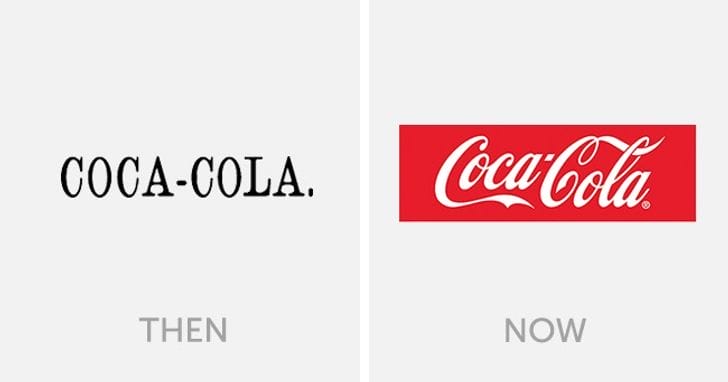
Coca Cola is literally one of the world's favorite drinks - Since its banned here, let's leave along Cuba and North Korea from this list for the moment, shall we? Well, what if we told you the signature branding that you've learnt to identify this drink with is only about a decade old. The brand itself is over a century old, but it took all this while to get someone to change the logo. Guess, little things do make a big difference!
McDONALD'S!
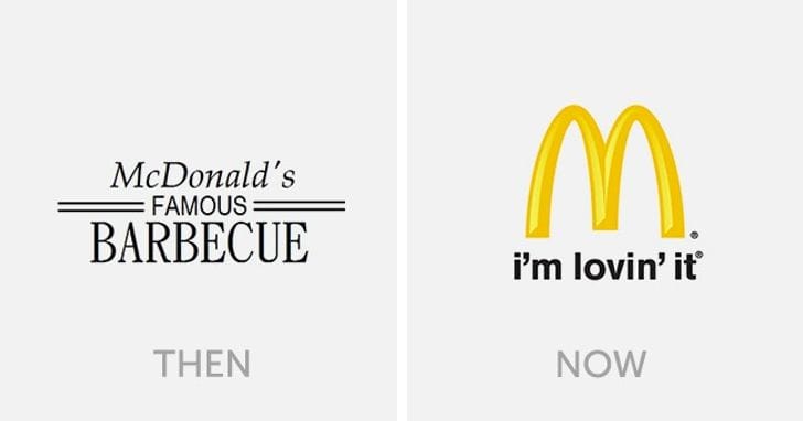
One is always loving life, when at Mcdonald's but the brand it self has a long list of mistakes that it overcame to reach where it is now. From monumental recipe changes to basic tagline changes, these guys have done it all. The oldest logo, from when they started in 1940's read McDonald's famous barbecue. Over time, fonts and styles kept changing to what it is today!
ADIDAS!
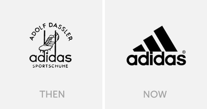
When Adidas said Impossible is Nothing, they probably kept manifesting a better logo and voila! Eventually, they got it. Let's all agree that the original logo was not just cluttered, but also really hideous. What Adidas has here today is sleek, original and just outright perfect!
INSTAGRAM!

If we like it or not is another debate, but most of us know of this brand and have literally seen it change overtime. Frequent users may be aware of the numerous "updates" that keep popping in. However, thankfully, the brand doesn't change its key features as it does its interface.
LIPTON!
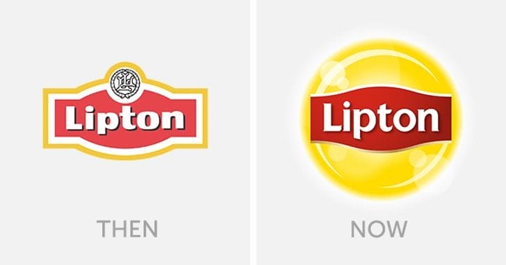
Tea drinkers are aware of this brand and even those who don't enjoy tea but are always tiptoeing around iced tea, you've probably even had it. This British brand is over 130 years old and presently owned by Pepsi and Unilever in an association called Pepsi Lipton International. The brand logo has moved on from being an archaic one to this more modern, easy to remember one!
Also read: 10 Famous Logos with Hidden Meanings That We Never Really NoticedSTARBUCKS!
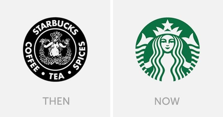
Starbucks started in 1971 did not know how big it was going to get, but it did and so big. Today with over 75 markets, it is one of the most premium coffee brands around. Like good brews, their logo perfection took time too. However, after a lot of changes and still retaining the beautiful mermaid in their logo - something that reminds them of the seafaring days of coffee traders, the logo is now a iconic icon!
IKEA!
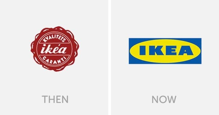
Changing furniture, but also changing lives is this furniture brand, Ikea. The concept of this brand was so unique that it could only survive in a progressive society. In its 77 years, it has gone on to revolutionize home design and furniture. The same can be said about its logo as well!
DISNEY!
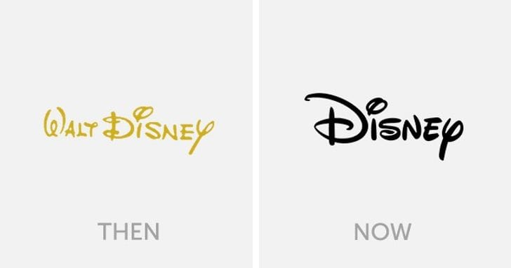
Disney's story is that of struggle, not giving up and triumph. So when Walt Disney started the company in 1920's, little did he know that there would be such a bright future - one that changed the idea of animation and cartoons forever. Here, the new logo is a recently adopted one and started taking place only in 2006. It truly takes years to build a brand and Disney has done it so well!
BURGER KING!

This company started in 1954, Miami and is today spread across 100 odd countries. What shot it to fame and made it famous, also inspired it to make some key changes in brand identity. The logo itself was a major turning point for Burger King. Moving on from a literal interpretation to a more nuanced one in 1999.


10 Famous Logos with Hidden Meanings That We Never Really Noticed
- 11:30 pm September 16, 2020
- surabhi

8 Popular Logos With Hidden Messages
- 12:51 pm May 22, 2018
- surabhi

10 Famous Logos That Actually Have An Secret Meaning Hidden In It
- 3:47 pm September 27, 2018
- surabhi

9 People Who Correctly Realized That Famous Logos Are Not What We Thought They Were
- 4:17 pm July 24, 2022
- surabhi

12 Famous Logos Then VS Now…
- 2:37 pm July 3, 2018
- surabhi

Do You Know The Hidden Meanings Behind These Famous Logos? They Are Pretty Interesting!
- 12:09 pm July 14, 2018
- surabhi