
10 Secrets Hidden Inside Famous Logos
- 5:20 pm March 24, 2018
- bhavna
Let's find out
#10 Apple
Rob Janoff is the man behind the design of this logo. According to him, the bite which is shown in the logo serves a practical purpose. Actually, the size of the bite shows that the shape was an apple, not a cherry
#9 Toyota
The name of this company which is now a leader in automobile manufacturer originated from the family name of the founder, Toyoda. If you look carefully, the logo has all the letters of the company name Toyota.
#8 VAIO
The subsidiary company of SONY that sells laptops. There was so much thought that was put into the making of the logo this brand name. The first two letters in the company’s name represent a digital waveform and the last two letters were meant to look like a 1 and a 0 presenting the notion of a fusion between analog and digital.
#7 Hyundai
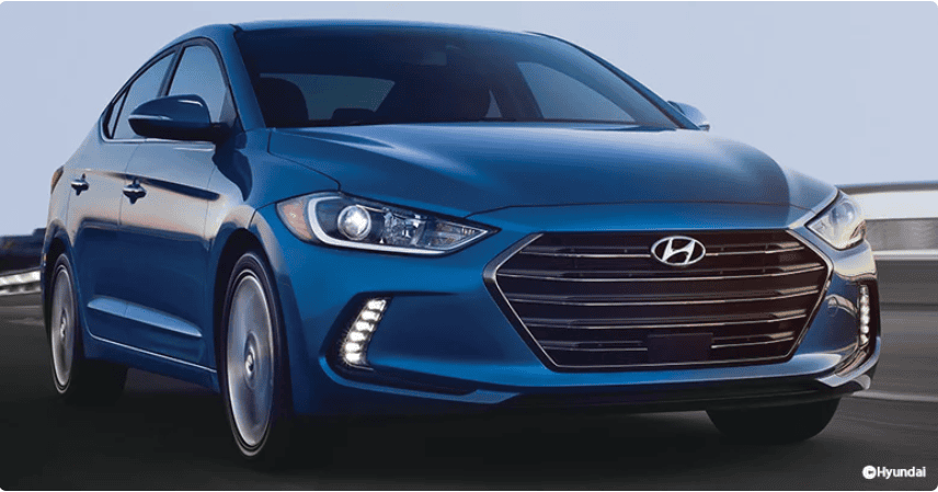
While most people will think the logo is actually a designed H which is the initial of the company name, but it is more than that. Upon magnifying your gazes you will find that it’s actually a representation of two figures; a Hyundai salesman shaking hands with a happy customer.
#6 Amazon
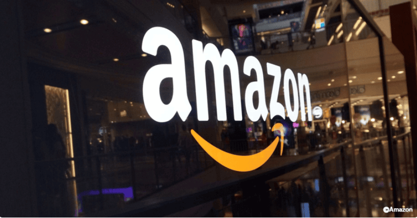
Look at that arrow beneath the name, now that's what it sells, so, Amazon is the perfect solution for your A to Z needs.
#5 CONTINENTAL
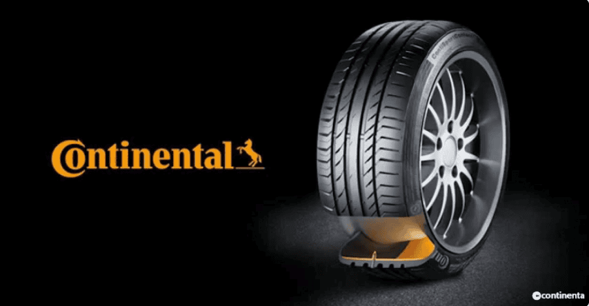
A tire manufacturing company, Continental has a simple but thoughtful logo, if you'll look carefully you'll find that the first two letters of the logo are meant to imitate a car wheel.
Also read: 10 Secrets Hidden Inside Famous Logos#4 Toblerone
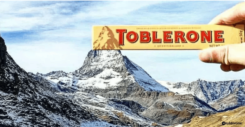
One of the oldest and vintage chocolate manufacturers, Toblerone is a Swiss company that carries out its operations in Bern, Switzerland. And if you'll look carefully, you'll see that it is the picture of the Swiss Alps. Also, the logo hides a bear in it because Bern is known as the city of bears.
#3 BMW
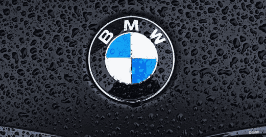
This German manufacturer, BMW, which began manufacturing aircrafts in 1916 slowly transformed into a mega car manufacturer over all these years. Many think that the checkered pattern in its logo is actually a depiction of the spinning propellers of an aircraft. But in reality, it is just a design copied from the Bavarian flag. Bavaria is the part of Germany where the company originated.
#2 DOMINO’S PIZZA
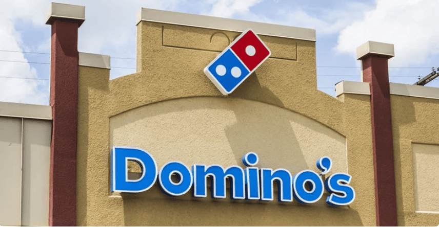
There is an interesting story behind the logo of this famous pizza company. So, one fine day, the college dropout Tom Monichan borrowed $1900 in order to buy his own pizza place which went by the name of Dominic’s Pizza. Five years later he bought two more stores in separate locations in search of business expansion. The former owner, however, refused Tom the permission to use his name in the franchise. So, Tom changed the name to Domino's and the logo that he designed has a dice which represent the first restaurant he bought followed by the next two.
#1 UNILEVER
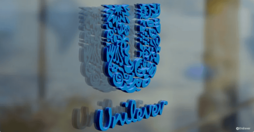
Unilever is actually a conglomerate that manufactures more than 400 consumers goods and these goods that are entire brands in themselves. Coming to the logo, the actual Unilever logo is made up of 25 other intricate logos, each with a rich meaning.

10 Secrets Hidden Inside Famous Logos
- 5:20 pm March 24, 2018
- bhavna

Do You Know The Hidden Meanings Behind These Famous Logos? They Are Pretty Interesting!
- 12:09 pm July 14, 2018
- bhavna

8 Popular Logos With Hidden Messages
- 12:51 pm May 22, 2018
- bhavna

9 People Who Correctly Realized That Famous Logos Are Not What We Thought They Were
- 4:17 pm July 24, 2022
- bhavna

8 Interesting Secrets Hidden In The Popular Logos!
- 1:17 pm April 25, 2022
- bhavna

10 Famous Logos That Actually Have An Secret Meaning Hidden In It
- 3:47 pm September 27, 2018
- bhavna